Ever watched someone pick up a product, turn it over, and pop it straight back on the shelf? It all happens in a couple of seconds. Shoppers size up whether something feels cheap or worth it before they read a single thing, and honestly, most of that snap verdict comes down to the packaging staring back at them.
So here’s the thing. Premium-looking labels lift the whole experience and build the kind of confidence that nudges a shopper from maybe to yes. Quality label printing makes a plain container feel like something worth trusting before anyone has even cracked it open. And people? They’ll happily pay a bit more for goods that simply look the part.
Your Label Is the First Salesperson You Never Pay
Looks Land Before Words Ever Do: Customers make their minds up fast, usually before they’ve read a single line. Texture, colour, finish: it all registers in that first glance down a busy aisle. A polished label hints at care, and care reads as quality, so your product feels worth more without you ever needing to spell out why it costs what it does.
Confidence Does the Heavy Lifting: Good packaging reassures people, and reassurance has a sneaky habit of loosening wallets. When a label looks right, shoppers just assume the contents match, so the customer appeal of a tidy product climbs without a single price cut in sight. That gut feeling? It’s the whole difference between a quick sale and a slow, dusty shelf-sitter that nobody touches.
A Smart Look Reads as a Safe Bet: Folks treat a sharp label as a little promise that someone cared about what’s inside. That quiet assumption does loads of selling for you, since shoppers rarely stop to question something that already looks sorted. Nail the surface, and the rest of your pitch feels believable before they’ve even taken in a single word of your copy.
Brands Play the Long Game on the Shelf
Positioning Happens Before a Word Is Read: Clever businesses don’t treat labels as an afterthought. They use them to claim a patch of territory, whether that reads as premium, playful, artisan, or clean and clinical. The right finish tells customers exactly where a product belongs in the market, so the brand earns its spot before the buyer has even clocked a rival price tag.
Consistency Is What People Remember: A recognisable look across a whole range hands shoppers a shortcut straight back to brands they liked. Strong visual branding ties every product together, so one good experience tugs customers toward the rest of the lineup almost without thinking. That kind of recall is hard to buy and even harder to fake with a rushed, mismatched design job.
Cheap Labels Cost More Than You Think
A Weak Label Drains Profit You Never See: A flat, forgettable design doesn’t just sit there looking a bit dull. It plants doubt, and doubt sends shoppers reaching for whoever happens to be next to you. Every product set back down is margin walking out the door, all because the packaging couldn’t make its case in those few precious seconds it actually had.
Skimping Now Bites You Later: Cutting corners on materials might save a few cents a unit, sure. But it can cost a brand its credibility right there on the shelf, in front of everyone. Customers read a cheap finish as a cheap product, fair or not. The bargain route often turns out properly pricey once all those lost sales start piling up.
Premium Is Built From Finishes, Not Flukes
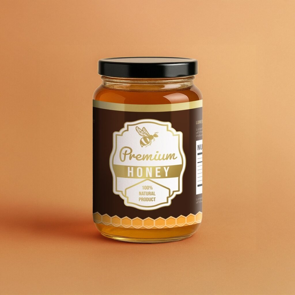
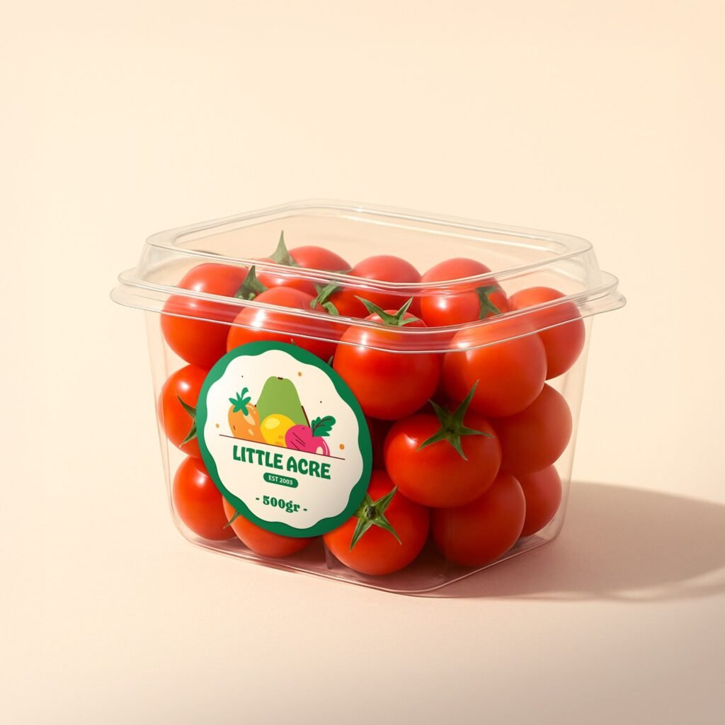
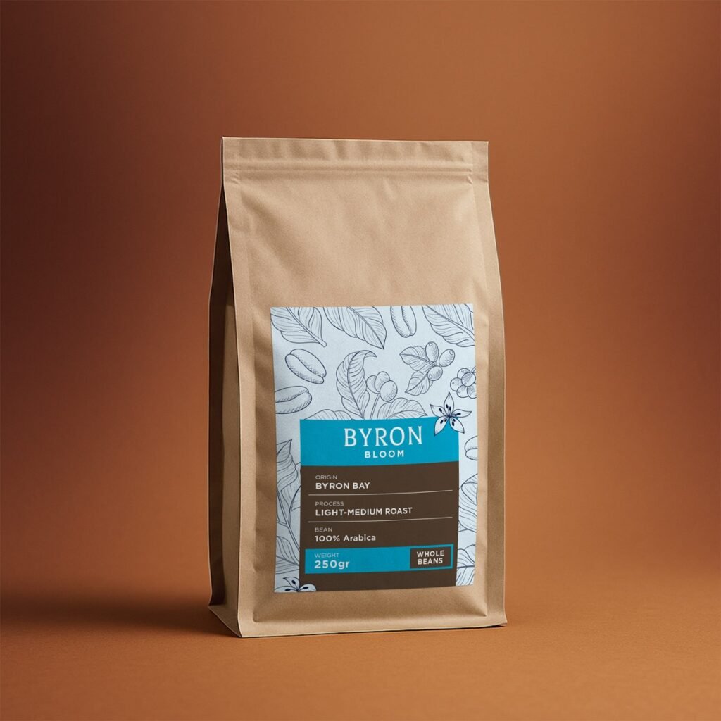
The Right Stock Changes Everything: Material does way more for perceived value than most owners reckon. Smooth papers with a matte or gloss laminate keep colours crisp and clean, while uncoated stock brings that textured, handmade feel artisan goods absolutely love. The choice sets the whole mood of the thing before you’ve even started fiddling with the actual design.
Texture Earns a Second Look: There’s something about an uncoated, tactile finish that makes a hand reach out almost on instinct. Premium wine labels have leaned on this trick for years, and it lifts sauces, preserves, and handmade goods every bit as well. A surface worth touching tends to be a product worth buying, simple as that really.
A Few Touches That Pull Real Weight: Some finishes earn their keep by making everyday products feel considered and a touch special. The clever move is matching the look to the goods rather than piling on every option going, since the wrong finish can cheapen a product just as quickly as the right one lifts it. So choose with a bit of care.
- Synthetic silver stock for a clean metallic shine that catches the light beautifully
- Uncoated textured paper that gives jars and bottles a crafted, hands-on feel
- Vibrant printing that keeps your brand colours bold from the production line to the shelf
- A matte or gloss laminate that guards the surface and sharpens every last detail
Let Your Packaging Do the Bragging
Premium never needs to shout. The best food labels carry real worth without making a fuss about it, turning a passing glance into an actual reason to buy. Get the material, finish, and design all working as a team, and your product earns trust the second it lands in someone’s view. Fancy making yours look the part? Request a quote and start printing labels that genuinely sell.